
Screenplay format is boring. Margins, fonts, slugs, parentheticals,none of it makes your story better on the page. But get it wrong, and readers notice. Producers notice. The script looks amateur before a single line of dialogue is read. So you need to know the rules, even if your only goal is to never think about them again.

Prompt: Dark Mode Technical Sketch, screenplay formatting rules with margin measurements and font callouts, clean thin white lines on black --ar 16:9
This guide covers the non-negotiable technical specs: Courier Prime (or Courier 12pt), margins, scene headings, and the rest of the formatting skeleton that the industry expects in 2026. We'll explain why each rule exists,not just "because that's how it's done," but the practical reasons (timing, readability, production) that keep these standards in place. By the end, you'll have a clear reference you can trust, and you'll understand why tools that handle formatting automatically,so you can focus on story,are increasingly the default for serious writers.
If you landed here from script writing format or industry standard screenplay format while still outlining, read idea to first draft first so you are not polishing margins on scenes you will cut. Fellowship-style clarity expectations (not a promise of placement) are summarized in the Academy Nicholl Fellowships in Screenwriting public reading criteria.
Why Screenplay Format Exists (Beyond Tradition)
Screenplay format didn't emerge from a committee of pedants. It emerged from production. A single script page, in standard format, translates to roughly one minute of screen time. That rule of thumb is why line producers and ADs can schedule a shoot: they read page count and get a workable estimate of days and budget. Mess with margins or font size, and that correlation breaks. Your "90-page" script might actually run 110 minutes, or 75. Suddenly you're the writer who broke the budget model.
Format also creates a shared language. When a reader sees INT. COFFEE SHOP - DAY, they know instantly: interior, location, time of day. When they see a character name in caps above dialogue, they know who's speaking without scanning. Consistency lets everyone,directors, actors, department heads,parse the document quickly. In a business where time is money, a script that obeys convention is a script that gets read instead of skimmed.
Format is the interface between your story and the machine that will turn it into a film.

Prompt: Dark Mode Technical Sketch, screenplay elements diagram showing slug, action, character, and dialogue, thin white lines on black --ar 16:9
So the "boring" rules aren't arbitrary. They're the interface between your story and the machine that will turn it into a film or show. Learn them once, and you can either apply them manually forever or use software that applies them for you. Either way, you need to know what correct looks like.
One more thing: format builds trust. When a development exec or a contest reader receives a script that looks correct from line one, they assume the writer knows what they're doing. When they see wrong margins, mixed fonts, or inconsistent slugs, they assume the opposite,and that assumption colors how they read every page. Getting format right is the lowest-friction way to signal that you're ready for the next step.
Fonts: Courier, 12pt, and Why It Still Matters in 2026
The industry standard is a monospaced serif font at 12-point size. Courier is the classic; Courier Prime is the modern, slightly more readable variant (better kerning and clarity on screen) that has become the preferred choice for many studios and fellowships. Some readers still expect "Courier" on the nose,if a submission guideline says "Courier 12pt," use that. When they don't specify, Courier Prime 12pt is the safe, professional default.
Why Monospace?
Monospace means every character occupies the same horizontal space. That predictability is what makes the one-page-per-minute rule reliable. Proportional fonts (like Times or Arial) compress some letters and stretch others; page counts would vary with word choice and punctuation. With Courier (or Courier Prime), a page of dense action and a page of sparse dialogue still occupy roughly the same physical space, so page count stays a meaningful proxy for length.
There's a second reason: scripts have been set in Courier for decades. Readers are conditioned to it. Changing the font doesn't make you look innovative; it makes you look like you don't know the format. Stick to 12pt. No 11pt to squeeze in an extra scene, no 14pt to hit a page count. Both tricks are visible and frowned upon.
Quick reference
Font: Courier or Courier Prime. Size: 12pt. No substitutions. If you're comparing tools, any serious screenwriting software in 2026 will lock this in by default so you never have to think about it.
Margins: The Invisible Skeleton
Standard screenplay margins are designed to produce that one-page-per-minute result and to leave room for binding and notes. Get them wrong, and your script will look off even if the content is perfect.
Page Margins
Left margin: 1.5 inches. Right margin: 1 inch (or 1.25 for some house styles). Top and bottom: typically 1 inch. The left margin is larger to allow for three-hole punching; the right is tighter because dialogue and action rarely extend to the full line. These aren't numbers you need to memorize,you need a tool that applies them. Manually setting margins in a word processor is error-prone and unnecessary when dedicated software does it correctly by default.
Element-Specific Margins
Each element type has its own horizontal position. Scene headings (slugs) start at the left margin (1.5"). Action runs from 1.5" to about 7.5" (so roughly 6" of text width). Character names are centered or placed at approximately 3.7" from the left (depending on the exact standard). Dialogue is inset from both sides,typically 2.5" from the left and 2.5" from the right (or 2" / 2"), creating a column of roughly 3.5" to 4" in width. Parentheticals sit inside the dialogue column, indented a bit more. Transitions (CUT TO:, FADE IN., etc.) are often right-aligned or placed at a specific position (e.g., ending around 7" from the left).
The exact numbers can vary slightly between studios and contests,some use 1" left for scene headings with a 0.5" indent for continued headings, and so on. The point is: there is a precise grid. Amateur scripts betray themselves with inconsistent indents, dialogue that runs too wide, or scene headings that don't align. Professional scripts look uniform because the software (or the writer) has applied the grid correctly.

Prompt: Dark Mode Technical Sketch, screenplay margin grid with vertical and horizontal guides, thin white lines on black --ar 16:9
[YOUTUBE VIDEO: Visual guide to screenplay margins and element positions - how to spot a non-standard script in seconds.]
Scene Headings (Slugs): INT, EXT, and the Rest
The scene heading,often called a "slug line",is the line that tells the reader where and when we are. It's one of the first things a reader scans. Get it wrong, and you look like you've never read a script.
Basic Structure
The standard form is: INT. LOCATION - TIME or EXT. LOCATION - TIME. INT = interior, EXT = exterior. Sometimes you'll see INT./EXT. for a space that straddles both (e.g., a car with the window down). The location is a short, clear identifier: COFFEE SHOP, MARIA'S APARTMENT - BEDROOM, HIGHWAY 101. The time is usually DAY or NIGHT; you can use LATER, MOMENTS LATER, SAME, CONTINUOUS, or specific times (3:47 AM) when it matters.
Capitalization and Punctuation
Scene headings are written in ALL CAPS. No period at the end. The dash between location and time is typically a double hyphen (--) or an em dash; be consistent. Subheadings (e.g., MARIA'S APARTMENT - BEDROOM) use a space and a hyphen to separate the parent location from the sub-location.
CONTINUED and LATER
When a scene continues after a cutaway (we see another scene, then return), some formats use CONT'D at the top of the next page under the scene heading to indicate we're still in the same scene. In modern practice, many writers and producers have dropped "CONT'D" on scene headings in favor of "LATER" or "MOMENTS LATER" when there's a time shift, and nothing when the cut is immediate. Contests and studios differ: when in doubt, follow the style of produced scripts in your genre. The key is consistency within your script.
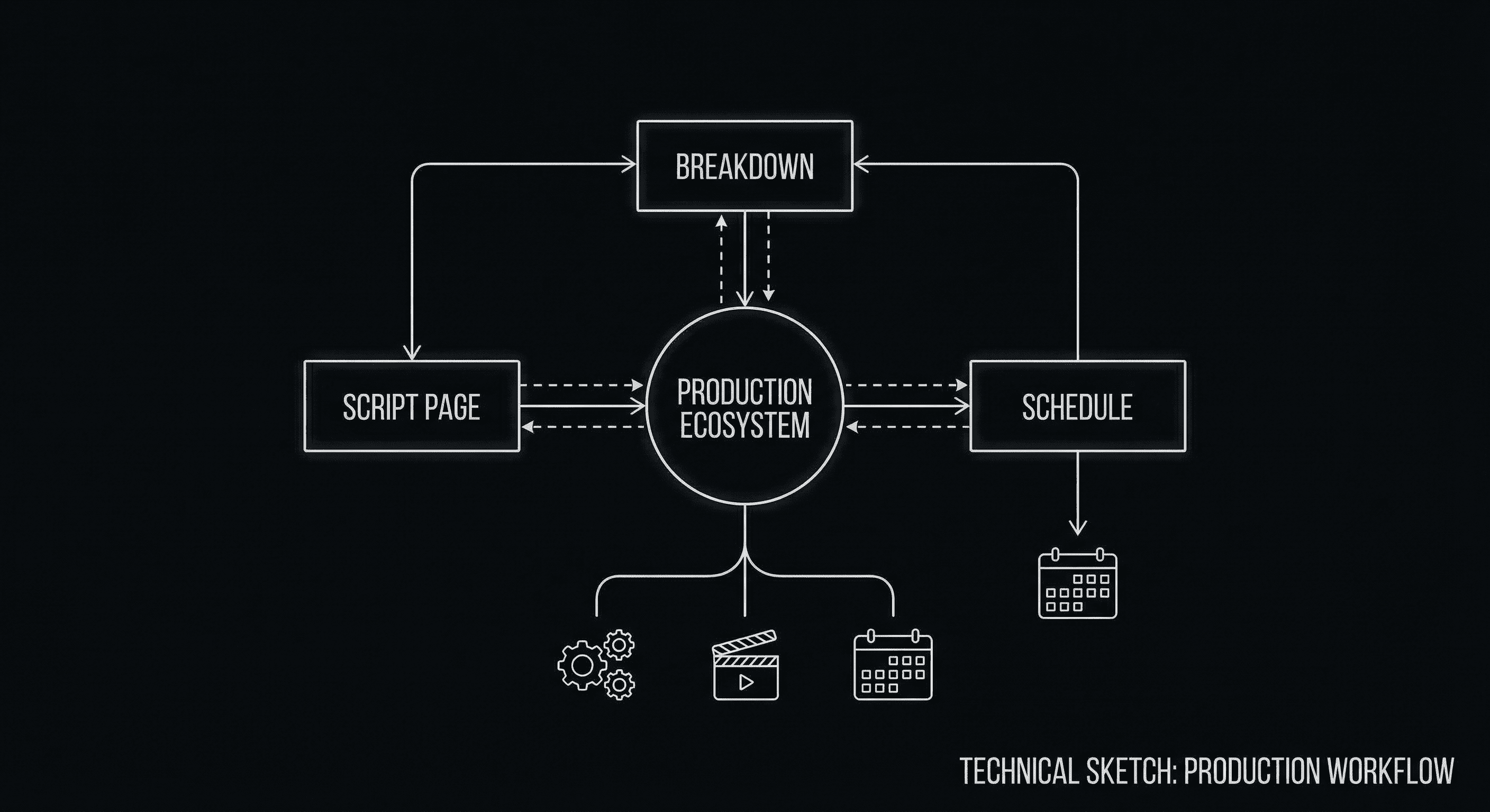
Slugs are also the backbone of production breakdowns. Every scene heading becomes a line item for scheduling and budgeting. Vague or inconsistent slugs ("SOME PLACE - DAY" vs. "INT. DINER - DAY") make the script harder to break down. Clear, consistent slugs make you look like you understand how scripts are used downstream.
Action, Character Names, Parentheticals, and Transitions
Below the slug comes the body of the scene: action (description) and dialogue, with a few supporting elements.
Action Lines
Action is the narrative description of what we see and hear,what the camera would capture. It's written in sentence case, present tense, from the left margin (same as the slug) to the right margin of the action block (about 7.5"). Keep paragraphs short: two to four lines max. Large blocks of action suggest overwriting or a novelist's instinct; film scripts breathe in shorter beats. You can use CAPS for important sounds, key props, or the first introduction of a character name, but don't overdo it. One or two caps per paragraph is plenty.
Character Names
Before each line of dialogue, the character name appears in ALL CAPS, centered (or at the standard character margin, e.g., 3.7" from the left). If the character is off-screen (O.S.) or in voice-over (V.O.), that goes in parentheses next to the name: MARIA (O.S.) or NARRATOR (V.O.). (O.S.) = off-screen; (V.O.) = voice-over. Be consistent.
Parentheticals
Parentheticals sit below the character name, inside the dialogue column, and indicate delivery or action during the line: (whispering), (to Tom), (beat). Use them sparingly. If the dialogue and action lines already make the reading clear, skip the parenthetical. Overuse reads as distrust of the reader or the actor.
Transitions
Transitions (CUT TO:, FADE IN., FADE OUT., DISSOLVE TO:, etc.) are often right-aligned. In contemporary scripts, "CUT TO:" is frequently omitted,the default between scenes is a cut. "FADE IN." usually appears once at the very beginning; "FADE OUT." or "FADE TO BLACK." at the end. When in doubt, use fewer transitions; they're most noticeable when overused.
Common Formatting Mistakes (And How to Avoid Them)
A few errors show up again and again in amateur scripts. Fix these and you're most of the way there.
- Wrong font or size. Anything other than Courier/Courier Prime 12pt signals that you didn't bother to check. No exceptions for "it looks better in Georgia."
- Inconsistent slugs. Mixing "INT. COFFEE SHOP - DAY" with "Interior - Coffee Shop - Day" or "INT. COFFEE SHOP - DAY" and "INT. COFFEE SHOP - NIGHT" without a clear time break confuses readers and breakdown software.
- Dialogue that's too wide. Dialogue should sit in a column. If it stretches to the same width as action, the script looks like a novel.
- Centered character names that aren't. Character names should be consistently placed. Slight drift suggests manual formatting or copy-paste from another program.
- Missing or wrong (O.S.) / (V.O.). If we hear someone we don't see, or we hear a narrator, the designation matters for production. Omit it and the AD will have to guess.
One more: overusing transitions. "CUT TO:" after every scene is redundant,the default is a cut. Save FADE IN. and FADE OUT. for the very beginning and end of the script. A page full of DISSOLVE TO: and SMASH CUT TO: reads like a first draft that hasn't been trimmed.
The fastest way to avoid these mistakes is to write in software that enforces the format. That doesn't mean you shouldn't understand the rules,you should. But once you do, letting the tool handle margins, fonts, and element positions frees you to focus on story. For a direct comparison of how different tools handle formatting and workflow, see our breakdown of Final Draft vs. ScreenWeaver, where we're clear about where classic formatting tools still excel and where modern tools take over the tedium.
Letting the Tool Handle Format: Why It's Not Cheating
Some writers treat manual formatting as a badge of honor. They'll tab and space their way through a script in Word or Google Docs, then wonder why their page count is wrong or why a reader said the script "felt off." The truth is, formatting is a solved problem. Software has been doing it correctly for decades. The question in 2026 isn't "can a program format my script?",it's "which program gives me correct format without making me think about it, so I can spend my energy on structure and story?"
ScreenWeaver is built with industry-standard formatting under the hood. You choose elements (scene heading, action, character, dialogue) or type in a way that the editor recognizes, and the margins, font (Courier Prime 12pt), and placement are applied automatically. You don't toggle font size or nudge indents. You write; the script looks correct. When you export to FDX or PDF for submission or production, the output matches what line producers and readers expect. That's not a workaround,it's the same standard that tools like Celtx and Final Draft aim for, with the difference that ScreenWeaver also gives you a Living Story Map, real-time structure visibility, and optional AI-assisted visualization. So you get correct format plus creative context, not just a typewriter that knows where to put the margins.
Format that matches production expectations,without manual margin tweaking.
If you're coming from a word processor or an app that doesn't enforce screenplay format, the shift to "the tool does it" can feel like losing control. You're not. You're gaining consistency. The only way to "lose" is to ship a script with wrong margins or the wrong font. Using software that guarantees correct format is the opposite of cheating,it's meeting the bar so your story can be judged on the page, not on the layout.
Mini-glossary: script writing meaning, format, and templates
Same Google box, three different people. On this site, every term below means film or TV screenplay, not cursive homework, not Arabic orthography, not a font meme.
Planner exports also mash in film script formatting, screenplay formatting, industry standard script format, and standard screenplay format, different adjectives, same job: margins, Courier (or Courier Prime) 12pt, element types a reader can scan in seconds. When vendors say "screenplay formatting software," they usually mean an app that enforces that grid so you do not fight Word for two hours. This guide is the spec; apps are the enforcement layer.
Script writing meaning. A timed grid: slugs, action, names, dialogue, transitions, roughly a minute a page so a line producer can squint and not feel lied to. Call it a script when it does that job.
Script writing format. Same beast as screenplay format: Courier or Courier Prime at 12pt, margins you do not get creative with, elements a machine can tag for breakdown. This guide is the ruler. For the tap-tap shortcuts that keep "INT. COFFEE SHOP" spelled the same every time, see script templates and macros.
Script writing template. Half the time writers want a blank layout that already behaves. Half the time they want snippets, character cues, recurring slugs. Serious apps ship the skeleton; you teach the muscle memory. Tiny free assists here: slugline formatter, title page maker. Neither pretends to be Final Draft in a trench coat.
Script example / script writing examples. Read produced PDFs to learn rhythm, sure. Your spec still has to walk through the metal detector: format before you send. Slips that get laughed out of the pile live in mistakes that get scripts tossed.
Summary: Know the Rules, Then Choose Your Workflow
The Trench Warfare: What Beginners Get Wrong
The "Novelization" Trap. Beginners often write dense paragraphs of action that describe every detail of a room or a character’s internal thoughts. This kills the pace and makes the script unreadable for production. Fix: Keep action lines to 2-4 lines max. Focus on what we see and hear.
The "Italic" Addiction. Using italics for emphasis in dialogue or action is a crutch. If the words don't carry the emphasis, italics won't save them. Fix: Rewrite the line for better rhythm. Use italics only for foreign words or specific titles.
The "Parenthetical" Crutch. (angry), (sad), (sarcastically). If you have to tell the actor how to feel, the dialogue is failing. Fix: Trust the actor and the context. Use parentheticals only for action during a line or to clarify a non-obvious delivery (e.g., "to himself").
If the scene is written well, the actor doesn't need a parenthetical to know they're angry.
The "Transition" Overload. CUT TO: between every scene is noise. Fix: Delete them. The scene heading already implies a cut. Use transitions only for specific effects like SMASH CUT TO: or MATCH CUT TO:.
The "Font" Gamble. Trying to stand out by using a "prettier" font like Helvetica or Times New Roman. Fix: Don't. You'll look like you don't know the rules. Stick to Courier Prime 12pt.
Screenplay format in 2026 is unchanged in spirit: Courier (or Courier Prime) 12pt, strict margins, clear scene headings, and a consistent grid for action, character names, dialogue, and parentheticals. The one-page-per-minute convention still drives production, and readers still expect scripts that look like scripts. The difference today is that you don't have to implement the rules by hand. You can learn them once,as we've outlined here,and then rely on software to apply them every time.
Use this guide as a reference when you're unsure about a slug, a margin, or a transition. Use it to spot-check exports from any tool. And when you're choosing or upgrading your screenwriting software, prefer tools that lock in correct format by default so you can focus on what actually matters: story, structure, and the words on the page. The boring rules are there for a reason. Your job is to satisfy them,then forget about them and write.
Write in Correct Format Without Thinking About It
ScreenWeaver applies industry-standard margins, Courier Prime 12pt, and slugs automatically. Focus on the story; we'll handle the rest.
Start Writing for FreeFinal Step
Build your next script with Screenweaver
Move from ideas to production-ready pages faster with timeline-native writing and AI-assisted story flow.
Try Screenweaver