

The page explodes. A full-bleed splash: the hero hurls himself through a wall of fire, glass shards suspended in mid-air, the word "KRAAKOOOM" arcing across the sky in jagged red letters. It's stunning. It stops you cold.
Now write that as a screenplay.
This is the adaptation problem. Comic books communicate through tools that don't exist in screenplays: visual onomatopoeia, splash page reveals, panel-to-panel rhythm, the reader's control over time. A great comic page can hold your eye for thirty seconds. A screenplay can only describe what happens and trust the reader to imagine the rest.
Adapting comics to film isn't translation, it's transformation. You're taking a medium that controls space (page layout) and giving it to a medium that controls time (shot duration). You're taking sound effects that are seen and making them heard. You're taking images that are frozen and making them move.
The writers who do this well understand that comics and film are siblings, not twins. They share visual DNA, but their grammars differ. The goal isn't to replicate the comic on screen, it's to create the same effect through different means.
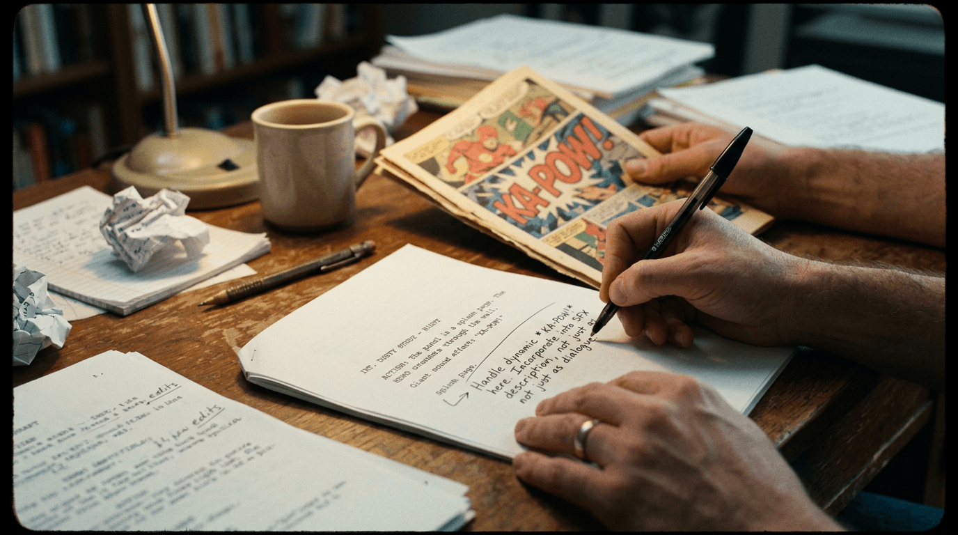
Cinematic workflow frames
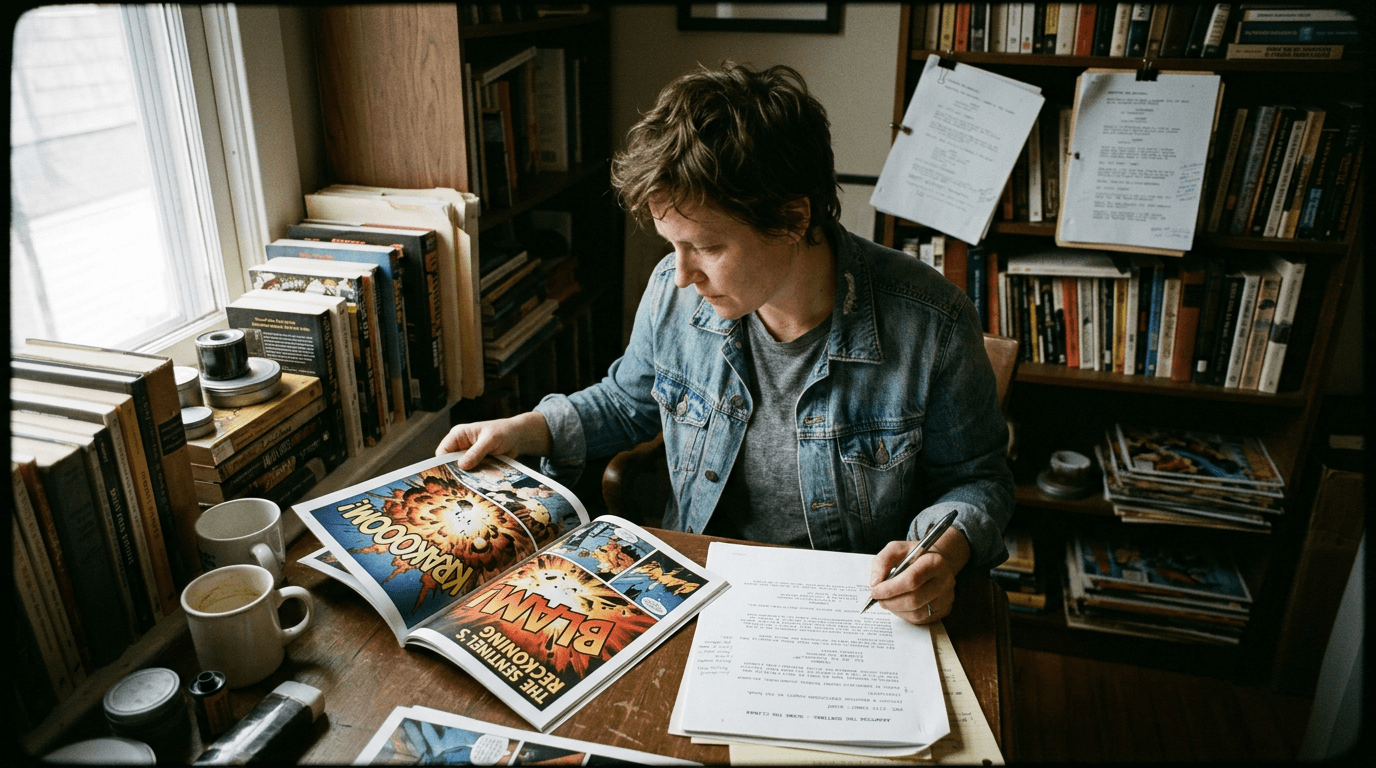
These two visuals work as a pair: the first shows Cinematic workflow still, first angle, 35mm film grain, and the second shifts to Cinematic workflow still, second angle, 35mm film grain—compare them briefly, then move on.
Why Comics Aren't Storyboards (Even Though They Look Like Them)
There's a common misconception: "Comics are basically storyboards. Adapting them should be easy."
This isn't true. Storyboards are instructions for a film that will move and sound. Comics are finished works of art designed for a reader who controls the pace. The differences matter.
Time in comics is malleable. A six-panel page might cover six seconds of action or six hours. The reader decides how long to linger on each panel. Film is tyrannical about time: a shot lasts exactly as long as it lasts.
Sound in comics is visual. "BLAM" on the page doesn't make noise; it creates visual emphasis. Film sound is literal: a gunshot sounds like a gunshot.
Splash pages create emphasis through space. A full-page image in a comic demands attention because it takes up physical real estate. Film creates emphasis through duration, framing, and editing, not page size.
Panel borders control rhythm. Dense grids feel fast; single panels feel slow. Film controls rhythm through cuts, not borders.
When you adapt a comic, you're not transcribing images into shots. You're analyzing the effect each comic page creates and finding filmic equivalents.
The question isn't "How do I put this panel on screen?" It's "What did this panel make me feel, and how do I make the audience feel that?"
Onomatopoeia: From Visual to Auditory
Comic books are dense with onomatopoeia, visual representations of sound. "WHAM," "SNIKT," "THWIPP," "BAMF." These words don't just indicate sounds; they convey force, texture, and style. The typography matters: blocky letters feel different than spiky ones.
In a screenplay, onomatopoeia disappears. You can't write "SNIKT" in the action line and expect anyone to know what that means. You have to describe the sound, and trust the sound designer to create it.
Here's the adaptation principle: translate the emotional quality of the sound, not just the fact of it.
Comic: Panel shows Wolverine's claws extending. "SNIKT" in sharp, metallic lettering.
Bad screenplay: "Wolverine extends his claws. SNIKT."
Good screenplay: "Wolverine's fists clench. Then, a sharp metallic SCRAPE, like knives dragged across bone, and three adamantium claws slide out between his knuckles."
The screenplay version takes more words, but it conveys what "SNIKT" conveys in the comic: the sound is violent, metallic, unsettling. The reader hears it in their head.
A Table: Translating Common Comic Sound Effects
| Comic Onomatopoeia | What It Represents | Screenplay Equivalent |
|---|---|---|
| BLAM | Gunshot | "The gun FIRES, loud, concussive, close." |
| THWIPP | Web-shooters (Spider-Man) | "A thin HISS of pressurized air. Webbing shoots from his wrist." |
| BAMF | Teleportation with sulfur (Nightcrawler) | "A POP of displaced air. The stink of sulfur. He's gone." |
| KRAAKOOOM | Explosion or thunder | "An EXPLOSION rips through the structure, bone-rattling, deafening." |
| THOOM | Heavy impact (Hulk landing, Thor's hammer) | "He lands. The ground CRACKS under the impact. Car alarms trigger for blocks." |
| SNIKT | Blade extension (Wolverine) | "A metallic SCRAPE. Claws slide out, gleaming." |
Notice that the screenplay versions add context: how the sound feels, what physical effects accompany it. This compensates for the loss of visual typography.
Splash Pages: From Space to Time
A splash page is a full-page (or double-page) image designed to stop the reader. It's a moment of emphasis, a reveal, a scale demonstration, an emotional peak.
Film doesn't have page sizes. Every frame is the same aspect ratio. So how do you create splash-page emphasis?
Option 1: Duration. Hold the shot longer than expected. Where a normal shot might last two seconds, hold the splash-equivalent for five or six. The audience feels the weight.
Option 2: Silence. Drop all sound except score (or nothing). The silence creates space.
Option 3: Scale and composition. Use wide shots, crane shots, or establishing shots that emphasize vastness. The frame fills with the scope of what's happening.
Option 4: Editing rhythm. Slow the cutting pace dramatically. If the preceding sequence has rapid cuts, a sudden long take feels like a splash page, everything stops.
Example:
Comic: Double-page splash of the Avengers assembled in a ruined city, the word "AVENGERS ASSEMBLE" floating above.
Screenplay:
EXT. MIDTOWN MANHATTAN – DAY

The dust settles. The camera CRANES UP,

, and the full scale of the Avengers comes into view. Six heroes, spread across the wreckage, turning to face the alien horde.

A long beat. No dialogue. Just the wind, and the distant rumble of enemy ships.

CAPTAIN AMERICA
(quiet, resolute)
Avengers... assemble.
The screenplay creates emphasis through crane movement, silence, and held duration, not through page size. The effect is similar: the audience feels the moment land.

Panel-to-Panel Rhythm: Cuts and Transitions
Comic artists control pacing through panel layout. Dense grids suggest rapid action. Wide, sparse panels suggest stillness or weight. The gutter (space between panels) creates beats.
In screenwriting, the equivalent is editing rhythm, how shots cut together. But you don't control editing directly; you suggest it through how you write action.
Fast panel sequences → Short, punchy action lines.
Comic: Nine-panel grid. Each panel shows a punch or block in a fight.
Screenplay:
Fists blur. Block, jab, cross,

, knee to the gut,

, elbow to the temple,

Danny drops. Hit hits the mat hard.
Short lines, em-dashes, white space. The page itself suggests speed.
Slow, contemplative panels → Long, descriptive paragraphs.
Comic: Three horizontal panels. A character walking through a graveyard at dusk. No dialogue.
Screenplay:
EXT. CEMETERY – DUSK

Sarah walks among the headstones. The grass is wet. The sky is the color of bruises.

She stops at one grave. Her mother's. She doesn't speak. Doesn't need to.

A long beat. The wind moves through the trees.
Longer sentences. Sensory detail. The prose breathes, which suggests a scene that breathes.
Try it free
Try Screenweaver for free on your script
It is free. Import your existing project, get a clearer view of your outline, and regain control of your story structure in minutes.
Start FreeThree Scenarios: Different Comic Adaptation Challenges
Scenario A: Superhero Action Sequence
The comic features a four-page fight: panel-dense, kinetic, full of onomatopoeia. Sound effects everywhere. The hero moves faster than the eye can follow.
Adaptation strategy: Convert the kinetic energy into rapid cuts and visceral sound design. Don't describe every punch; describe the feel of the fight, chaotic, overwhelming, brutal. Let the stunt coordinator choreograph specifics; your job is to convey style.
Sample approach:
The fight is a BLUR,

Fist meets face meets wall meets floor. CRACK. THUD. A spray of blood.

Spider-Man bounces off walls, momentum never slowing. He's everywhere and nowhere.

The thugs don't stand a chance.
Scenario B: Dialogue-Heavy Scene
The comic features two characters talking across six pages. Lots of close-ups on faces. The rhythm comes from alternating panels and the timing of word balloons.
Adaptation strategy: This translates more directly, dialogue is dialogue. But capture the visual emphasis. If the comic holds on a face for a full panel, the screenplay should indicate a beat. If a word balloon is isolated (emphasis), the dialogue should have its own line.
Sample approach:
MATT
You knew. The whole time, you knew.

FOGGY
(beat)
I knew.

The words hang. Neither moves.

MATT
And you said nothing.

Foggy looks away. When he looks back, his eyes are wet.

FOGGY
I didn't know how.
Scenario C: Symbolic/Surreal Imagery
The comic features a dream sequence with impossible imagery: the hero falling through panels, memories bleeding into each other, visual metaphors made literal.
Adaptation strategy: Film can achieve surreal imagery, but differently. Describe the effect, disorientation, fragmentation, emotional weight, rather than the exact panel content. Trust the director to interpret.
Sample approach:
DREAM SEQUENCE – FRAGMENTED

Images bleed into each other,

, falling through space,

, her father's face, distorted,

, the sound of breaking glass, repeating, repeating,

She wakes GASPING.
The "Trench Warfare" Section: What Adapters Get Wrong
Failure Mode #1: Panel-by-Panel Transcription
The adapter describes every panel as a shot. "Panel one: close-up on hand. Panel two: medium shot of character. Panel three: wide shot of room." The screenplay reads like a storyboard, not a script.
How to Fix It: Write in scene units, not panel units. Describe the action and emotional beats; let the director decide shot breakdowns.
Failure Mode #2: Literal Onomatopoeia
The adapter writes "BAMF!" in the action line, assuming everyone knows what that means. They don't.
How to Fix It: Describe what the sound sounds like. Use sensory language. "A sharp POP of displaced air, leaving the smell of sulfur."
Failure Mode #3: Losing the Splash Impact
The adapter treats splash pages like any other scene. The big reveal reads the same as a transition. The emphasis is lost.
How to Fix It: Mark splash moments with white space, held beats, and deliberate pacing. The screenplay page should feel different when something is meant to land hard.
Failure Mode #4: Ignoring What the Comic Does Well
The adapter changes everything because "film is different." But the comic's strengths, its dialogue, its character dynamics, its set pieces, get diluted.
How to Fix It: Identify what works and protect it. Change what must change (medium-specific techniques); preserve what can stay (story, character, tone).
Failure Mode #5: Over-Describing Action
The adapter, worried about clarity, describes every move in a fight. The screenplay runs ten pages for a sequence that should run three minutes.
How to Fix It: Write action for rhythm, not choreography. "They fight, brutal, ugly, exhausting. By the end, both are bloodied." The stunt team handles the rest.

Preserving the Comic's Soul
Every successful comic has a soul, a tonal essence that makes it distinctive. Watchmen is melancholic and politically charged. Scott Pilgrim is irreverent and visually playful. Saga is operatic and emotionally raw.
The adapter's job is to identify that soul and find filmic ways to preserve it. This might mean:
- Visual style choices. Sin City used heavy contrast and selective color to echo the comic's stark aesthetic.
- Structural choices. Watchmen intercut storylines like the comic, preserving the fragmented narrative.
- Tonal choices. Thor: Ragnarok embraced comic absurdity rather than the grim tone of earlier films.
Before you adapt, ask: What makes this comic this comic? What would be lost if we changed it? Those elements are non-negotiable. Everything else is open for transformation.
The Perspective: Two Mediums, One Story
Comic book adaptation isn't about fidelity to panels. It's about fidelity to effect. The comic made readers feel something, awe, tension, laughter, sorrow. Your screenplay must make audiences feel those same things, using different tools.
Onomatopoeia becomes sound design. Splash pages become held shots. Panel rhythm becomes cutting pace. Visual metaphor becomes cinematic technique.
The story survives the translation. The characters survive. The soul survives. But the execution transforms, because it must. You're not copying a document. You're reperforming a work of art in a different key.
When it works, the audience feels like they're watching the comic come to life. Not literally, literally is impossible, but spiritually. The adaptation captures what they loved and shows it to them again, fresh, moving, sounding, breathing.
That's the goal. That's the craft. That's why adaptation is as creative as original writing, because you're solving problems the original creator never faced.
[YOUTUBE VIDEO: A side-by-side comparison of comic panels and their film adaptations, analyzing what was preserved, what changed, and why the adaptations succeeded or failed.]
Further reading:
- For guidance on writing visual action sequences, see our guide on describing a continuous take without cluttering the page.
- If you're adapting manga specifically, see scripting manga or anime: specific codes you need to know.
- The Comics Journal covers adaptation theory and practice at tcj.com{:rel="nofollow"}.
Final Step
Build your next script with Screenweaver
Move from ideas to production-ready pages faster with timeline-native writing and AI-assisted story flow.
Try Screenweaver